t-SNE explained: Visualizing High-Dimensional Data
Now Playing
t-SNE explained: Visualizing High-Dimensional Data
Transcript
484 segments
In this video, we will have a look at
the TNE method which can be used for
visualizing highdimensional data in for
example two dimensions. TNE or TSN
stands for T distributed stochastic
neighbor embedding which is a method
that captures local structures of
highdimensional data while also
revealing the global structure such as
the presence of clusters. The Tney
method was published in 2008 and the
equations that I will show at the end of
this video are given according to this
paper and from Wikipedia. I will first
show some applications where Tesnney can
be used and compare it with principle
component analysis. Then we will have a
look at the simple example that explains
the basic idea behind Tesney before we
go into the mathematical details.
We will first see how TNE and PCA
perform on the classical Amnes data set
which contains thousands of images of
handwritten digits.
Every row in this data set contains
pixel values for each image. The first
column shows which digit the image
contains. For example, the first row
represents an image of a handwritten
five, whereas the second row represents
an image of a handwritten zero and so
forth. Each image is a square that
contains 784 pixels, which means that
each image or row has 784 columns in
addition to the first column. Suppose
that we like to generate an image of the
data that is located on row number six.
We would then put the elements in column
numbers 2 to 29 here. Then the next 28
elements here and so forth
until we have a square matrix with 28
rows and columns. This image is supposed
to represent a handwritten two.
We will now use TNE and PCA to compress
these 784 columns
into just two columns and plot these
columns in two-dimensional plot and
label the points so that we can see
which point that corresponds to a
certain digit just like PCA tney is an
unsupervised method because it does not
use these labels in its computation to
identify the groups. This is an example
of a teas plot of 10,000 images in the
amnes data set. Each point in this plot
represents one image. For example, this
point represents the following
handwritten eight whereas this point
represents a four.
We can see that the tin plot separates
the images of the 10 digits quite well.
In comparison, this is the corresponding
PCA plot of the AMNES data set which
fails to separate the digits. I will
explain why in a minute.
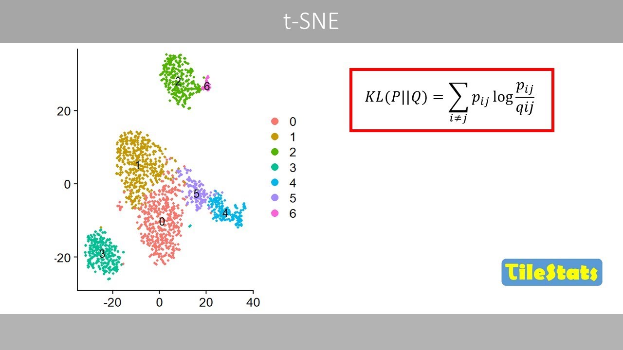
Tnip plots are commonly used in single
cell RNA sequencing to visualize
highdimensional gene expression data in
two dimensions to identify clusters of
cells with similar expressed genes.
Each point in this tney plot represents
a single cell. Points in the same
cluster can be seen as cells that have a
similar gene expression profile. Such a
cluster of cells therefore usually
represent cells of the same cell type.
For example, the clusters may represent
different cells in our immune system.
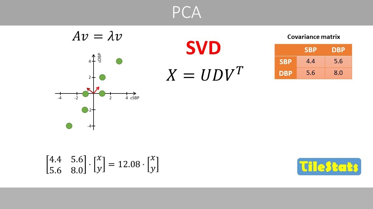
If you were to use PCA on the same data
set, the clusters would not separate
well. So why is this the case?
Well, one reason is that a PCA plot
usually only shows the first two
principal components because these
explain most of the variance.
By illustrating only the first two
components, which in this case only
explain about 5% of the total variance,
we lose a lot of information that is
stored in the other components. For
example, we can see that clusters two
and six are not well separated based on
the first two components.
If you instead plot component one versus
component five, clusters two and six are
now well separated. The TD method does
not hold important information in
several components like this. Instead,
it includes all information into just
two dimensions, which explains why the
TED plot barely shows the clusters that
exist in the highdimensional data.
However, the TS method is
computationally expensive, which is why
it is sometimes combined with PCA. One
can therefore compress the variables by
first using PCA and select for example
the first 30 to 50 components that store
most information and then computing the
Tnney plot based on these components
instead of all variables.
Another reason why PCA might fail to
separate the existing clusters is that
it is a linear method. For example, if
you were to project this nonlinear
two-dimensional data set in one
dimension, the clusters will not
separate well with PCA. Whereas the TI
method would do a good job in separating
the existing clusters because it
preserves local nonlinear relationships.
All of these points are fairly close in
the global geometry. Disney tries to
preserve the local neighborhoods. Points
that are close have a high probability
of being neighbors, which means that
these points have also a high
probability of being neighbors and so
forth.
Another example where Tesney is commonly
used is to visualize word embeddings.
This is the same data that I showed in
the video about transformers.
The GPT model had about 12,000 embedding
dimensions.
If we were to compress thousands of word
embedding dimensions into just two by
using Tesney, we would get the plot like
this where every point represents a word
or a token. For example, this plot shows
5,000 words. Similar words are close in
this Tesnney plot because their
highdimensional embeddings have similar
features or contextual meanings.
So when you see a Tesney plot like this,
you can interpret it like points that
are close together in the Tesnney plot
were likely close neighbors in the
original highdimensional space.
However, you should not use the plot to
compare distances between clusters. For
example, eights and sixes in amnes data
set are here far apart, although they
are expected to be close in a
highdimensional space since such
handwritten digits should be quite
similar. Also, do not try to interpret
the numbers on the axis because these
values do not mean anything. We will now
have a look at the very simple example
to illustrate the basics of how tis
works before we go into its exact
mathematical details.
Suppose that we have the following
simple three-dimensional data set with
five data points which can be visualized
like this in a three-dimensional scatter
plot. We see that data points four and
five are close
whereas data points one two and three
are close. The idea is to project these
data points into two dimensions so that
we can visualize the data in a simple
two-dimensional scatter plot. In tis the
highdimensional space refers to the
original data whereas the lowdimensional
space is a simplified representation
that preserves the local similarities
between the points. The method starts by
calculating the client distance between
all data points of the original data.
For example, if we were to calculate the
distance between data points one and
five, we would plug in the x, y, and z
coordinates in this equation and do the
math.
We now plug in the rounded ukidian
distance in a distance matrix. If we
calculate the distances between all data
points in our data set, we would get the
following values. For example, we can
see that the ecclesian distance between
data points 2 and 4 is 5.2.
Then we might normalize these distances
by for example dividing all the values
by the maximum value in this matrix so
that we get the following values.
Next, we place five data points at
random coordinates in a two-dimensional
space and calculate the client distance
between the points. For example, to
calculate the distance between data
points one and three,
we plug in the x and y coordinates of
these two data points and do the math.
Next, we normalize the distances by
dividing by the maximum value in this
matrix.
so that we get these values. The reason
why we normalize is that we can now
better compare the distances.
Data points in high dimensions have
generally longer distances to each other
than in low dimensions, which explains
why we normalize the distances. The idea
is now to move around these data points
so that the normalized distances in two
dimensions are as close as possible to
the normalized distances in the high
dimensional space. For example, we can
see that the normalized distances
between data points two and three differ
quite much in the high and low
dimensional space. Let's move this data
point from here
to here and recalculate the normalized
distances. We see that the distances now
become more similar to the normalized
distances in three dimensions, which
means that the points in the
two-dimensional plot now better resemble
the points in the highdimensional space.
If we continue to move around the data
points, we might end up with the
following plot that looks quite similar
to the plot in three dimensions. We also
see that these two matrices now have
similar values.
We will now have a look at the math
behind TES.
The method starts by calculating the
Eian distances between the data points
in the highdimensional space. Just as we
did before, the distances are here shown
with two decimal places. Note that I
also fill the upper triangle of this
matrix. And you will see why soon. So
these values are the same because they
both represent the distance between data
points one and three.
Next, we square the distances.
We'll now calculate the conditional
probabilities
where these terms correspond to our
squared distances.
This formula can be used to calculate
the normal distribution.
So what we have up here is similar to
this part of the formula for the normal
distribution.
So the numerator can be seen as the
height of a normal or Gaussian
distribution for a given distance
between two data points. where sigma
squar represents the variance which
controls the width of the normal
distribution to simplify the calculation
I will here use a fixed value of sigma
so that these two terms are equal to one
in tney the value of sigma is not fixed
and is related to the so-called
perplexity parameter that I will explain
at the end of this video let's apply
this formula to Calculate the
conditional probability in row two,
column 1. We plug in the squared
ecclesian distance between data points
one and two. Here what we get in the
numerator can be seen as the height of
the Gaussian curve for the squared
ecclesian distance between data points
one and two. Then we plug in the values
of the second row in the denominator but
not for the distance between a data
point and itself. This term can be seen
as the height of the Gaussian curve
based on the distance between data
points one and two. And this is the
height based on the distance between
data points two and three.
The heights that correspond to the
distances from data point two to data
points four and five will be super
small.
If you do the math, we get the value of
about 0.39
which we plug in into a matrix with
conditional probabilities.
If we compute the whole matrix, we'll
get these values where each row now sum
ups to one.
So this row can be seen as conditional
probabilities that data point one would
pick one of the other four data points
as its neighbor.
For nearby data points the conditional
probability is high whereas for data
points further away the conditional
probabilities will be super small for
reasonable values of sigma.
So the tney method can be seen as it
uses large parise distances between the
similar data points and small parise
distances between similar data points.
Note that the values for data points one
and three are different.
One therefore computes the average of
these two values and also divides by the
sample size.
In this case, we get a value of 0.11
that we plug in here. Then we compute
the same for the other elements.
We now have a symmetric matrix where all
its values now sum up to one. We are now
done with all the calculations for the
highdimensional data. Let's put it here
as a reference.
Next, we place five data points in a
two-dimensional space with random
coordinates, which explains why tney is
a stochastic method because the initial
coordinates will be different every time
we create a new plot. Then we calculate
the squared ecclesian distances between
the five data points in the
lowdimensional space.
We can now use the same equation based
on the Gaussian distribution as we used
previously where sigma is set to one
over the square root of two so that this
equation no longer depends on sigma.
However, we will then generate an SN
plot which tends to squeeze the points
too much which causes the crowding
problem as explained in the te paper.
They therefore used a formula based on
the t distribution with one degree of
freedom which will generate the tney
plot. The t in the name tney therefore
refers to the t distribution.
The reason for instead using the t
distribution with one degree of freedom
is that it is wider compared to the
gaussian distribution.
So to compute the value of the Q matrix,
for example, for the third row, first
column, we plug in the squared eidian
distance here
and all the other values in this matrix
that are not included in the main
diagonal in the denominator.
We then fill in this value in the Q
matrix.
If you do the same calculations for the
other elements in this matrix, it will
include these values which should sum up
to one. So the idea is now to move
around these data points so that the
values in the Q matrix become as similar
as possible to the ones in the P matrix.
This can be done by minimizing this cost
function.
If the values in the two matrices are
identical, the value of this ratio will
be equal to one. And since the log of
one is zero, the cost function would
then be equal to zero, which means that
the two matrices are identical.
Let's plug in our values except for the
values in the main diagonal to compute
the value of this cost function.
We see that our cost function results in
a value of 0.77.
What is interesting with this cost
function is that it will generate a
large penalty for a large pig if the
corresponding Q is too small.
This means that the cost function mainly
focuses on the corresponding errors for
points that are closed in the
highdimensional space which is one
reason why tney strongly preserves the
local neighborhoods
to reduce the value of this cost
function. We can use the method of
gradient descent. We therefore need to
compute the derivative of this function.
This is the derivative of the cost
function that we can use in the gradient
descent method. How to derive this
function can be found in the original
tney paper.
These are our P and Q matrices and the
Y's are the coordinates of the given
data points in the low dimensional
space.
We now plug in our values in this
function for the first row where I is
equal to one and J is equal to two.
Now J is increased by one which means
that we take the corresponding values in
the third column.
Then we increase J to four
and five and do the math which here show
values from calculations with more
decimals.
Then we increase I to two and do the
same calculations.
If you do the calculations for all rows,
we will get these values
which we plug in in the gradient descent
formula. where alpha is the learning
rate that were here set to one. These
are our current coordinates in the
lowdimensional space.
In the paper, they also added a momentum
term for a smoother update, but we will
not use that term here. So if you
substract these values
from these values, we'll get these
updated values
and the coordinates of the data points
will be updated
like this. With these updated values, we
have reduced the cost function from 0.77
to 0.56.
We then iterate like this until we reach
some convergence or until we reach the
maximum number of iterations.
After 100 iterations,
I got the following plots that closely
resembles what we see in the
highdimensional space. After 100
iterations,
these are the values in the Q matrix,
which closely match those in the P
matrix.
So the main idea with the teasing method
is to minimize the difference between
the distances based on the conditional
probabilities in the high and low
dimensional space to preserve both local
and global structures in the data.
Finally, we will discuss the perplexity
hyperparameter.
Remember that we previously used a fixed
value of sigma. Tney does not use the
same sigma for all points.
So for each point we find an appropriate
value of sigma so that two to the power
of the Shannon entropy of the
conditional probabilities is
approximately equal to the chosen
perplexity parameter. A larger
perplexity parameter generally results
in larger values of sigma. The
recommended value of the perplexity
parameter is in the range of 5 to 50.
So here are three plots of the amnes
data set which show how the perplexity
parameter changes the plots.
If you set the perplexity parameter to
five, the clusters are much closer than
if you set a larger value of the
perplexity parameter.
So you need to try a few values of this
parameter until you find an appropriate
plot that you like to show. Note that
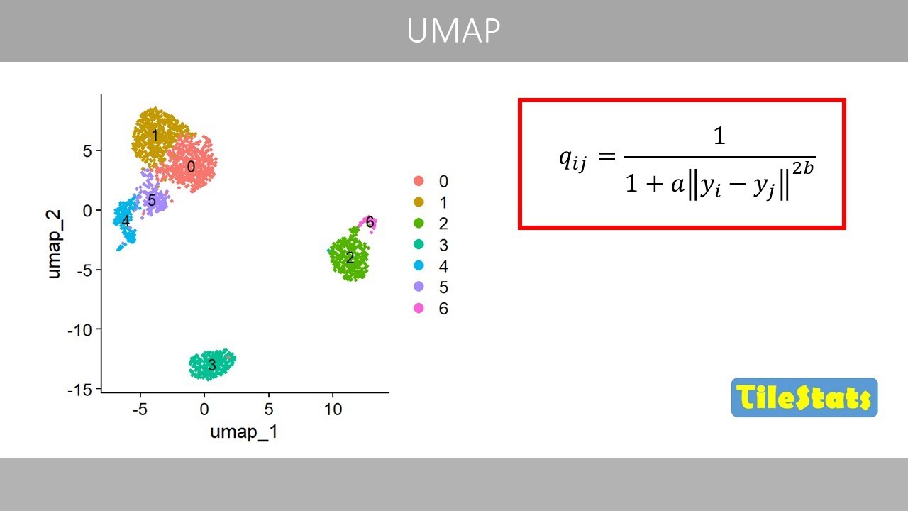
there is a related method called UAP
which produces similar plots as the TE
method. I will explain the UMAP method
in a future video.
This was the end of this video about the
TES method. Thanks for watching.
Interactive Summary
Ask follow-up questions or revisit key timestamps.
This video explains the T-distributed Stochastic Neighbor Embedding (T-SNE) method, a technique used for visualizing high-dimensional data in lower dimensions, typically two. It contrasts T-SNE with Principal Component Analysis (PCA), highlighting T-SNE's ability to preserve local structures and reveal global patterns like clusters, which PCA often fails to do. The explanation covers applications in datasets like MNIST digits and single-cell RNA sequencing, as well as word embeddings. The video then delves into the mathematical details of T-SNE, including the calculation of conditional probabilities, the use of a cost function based on the Kullback-Leibler divergence, and the optimization process using gradient descent. Finally, it discusses the perplexity hyperparameter and its effect on the resulting visualization, mentioning UMAP as a related method.
Suggested questions
8 ready-made promptsRecently Distilled
Videos recently processed by our community
